Tuesday, September 30, 2008

Paris Collections: Vivienne Westwood Gold Label

Vivienne Westwood Spring 2009 Ready-to-Wear

Fabulous.


A huge improvement over her Fall 2008 collection (although not quite as theatrical, unfortunately) Viv's Spring Gold Label collection doesn't cease to amaze and inspire. The soft, downy folds of  duchess satin, the shoulder-obliterating silhouettes, the rumpled folds, the S&M straps all accumulate into an awe-inducing collection that hearkens back to Viv's signature styles and beginnings while still being fresh and new. And, while not perfect on the cohesion front, Vivienne makes her statement quite well. She's certainly incorporating some questionable fabrics, though, including a beach umbrella one, but she's a rebel. 

Monday, September 29, 2008

Applied Art

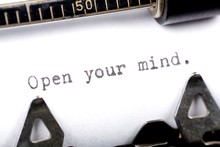
open-your-mind_id6247141_size220.jpg

From a Target ad in this Sunday's NY Times magazine:

A day without great design? We can't imagine it. From your coffeemaker to the organizers in your home office to your pillows made from bamboo, great design gets us through our day. And that's why we're so committed to it. Better, smarter, easier, brighter–all at amazing prices...What's not to love about great design?

Sunday, September 21, 2008

Bored-In

                                    grateful dead wallpaper

I got excited for the first time in a while when I read that there was going to be a human Be-In in Central Park; I grabbed my love beads and patchouli oil and set out. 

Turns out I should have just stayed cynical. No pot, no LSD, no nudity, no protesting, no singing, no dancing, no lovemaking. Just haughty actors who, while not staying within their own circle, lackadaisically handed out flowers (roses of all things! and plastic daisies! plastic!) and grapes from Gristedes. How disappointing to see that no youth or vigor can be stirred up for one of the most important philosophies that may ever exist: Peace. Especially in a time of war. 

But that's not what cinched it for me; once I saw a skinny blonde girl pull an iPhone from her Marc Jacobs bag, I was out of there. As much as I can respect the certain accouterments that go hand in hand with the modern consumer, there's just a disconnect from reality that stems from said materials. And a Be-In is not the place for a disconnect.  

Perhaps we will never relive 1967; and maybe that's a good thing. Let us strive to create our own gatherings and offerings for peace. 

Friday, September 19, 2008

London Collections: Vivienne Westwood Red Label

Vivienne Westwood Red Label Spring 2009 Ready-to-Wear

You know my loyal reader(s?), I thought I would go ahead and blog about the collections, but New York Fashion week was, as always, kind of dull. Nothing really stood out, so why bother writing? Check out Diane Von Furstenburg's hippie clothes and Marc Jacobs's multinational, mutlilayered looks. Done. I'll talk more about Paris Fashion Week (namely Dame Westwood and maybe a few others) and the couture shows (namely Galliano, Gaultier, Lagerfeld and LaCroix).

Let's talk of Viv's Red Label, though, shall we?


Honestly? I agree with them; nice, but nothing particularly new or surprising. Pure Westwood. Pure current Westwood, anyway. Hopefully she's pulling out the big guns for her Gold Label, which is usually how it goes. I happen to like the uber-structured looks rather than the crumpled ones. 

And the metallics are tacky, no question about that. 


Saturday, September 13, 2008

A better taste of the Finalists' Shows...

New York Collections: Leanne

Leanne certainly has come a long way, hasn't she? What started as haphazard concoctions of coffee filters, meringue  cookies and her signature circles developed into a chic, innovative design aesthetic, all thanks to a little whipping from the judges. Take notes, Keith; when they criticized her, she didn't just get defensive and start making boring dresses, she took what she liked and edited it to make something beautiful; and that's exactly what she did in this collection.  


Beautiful and interesting. The bubble skirt is surprisingly flattering and creative, although I can't say I cared too much for how it moves; almost (I hate to say it) comparable to some of Suede's skirts. They just rustle a lot in the wind, and it serves as a distraction. 


The proportions on the skirt don't work with that hem, or with that height. It's too much like a mushroom cap. The top is interesting, though, although it teeters awfully close to folded napkin territory. 


Hm...you know, this collection was not at all bad, but looking at each piece individually shows how off-kilter its start was. The top looks like a party favor. The pants are great, but also...this color palette is getting old. Don't get me wrong, it's clean and minimal and very spring, but look after look is the same pairing of colors. Korto did a good job because most of her looks were variegated, but Leanne repeats the same combinations in blocks, and within each of those blocks are not much variety. That's not a huge complaint, I guess, considering most professional collections are the same way, but introducing one or two other colors wouldn't have hurt.


This is a little too casual; it looks like something a put-together housewife would wear to pick her kids up from school.


There's no question about it, this was stunning. The skirt is not too busy, and it works perfectly against that bodice. The time-old contrast of the tight bodice and full skirt was really re-imagined here, and is a testament to her skills as an innovator.


My god, was this perfect. The high, layered collar and angled front once again show how engrossing her clothes can be.  And perfect model choice, by the way.


She looks like an ice pixie. That's not really a bad thing; it's very whimsical, but not at all immature or tacky. I feel that there's a bit too much going on at the top, but I do have to say this turquoise is a lot classier than the other shade she has.


See what I mean? It's a little too saturated. And she looks like an tornado in the arctic. Not terrible, but the sides of the bodice are especially bulky. 


No. Just no. This was truly tawdry. It's a total prom dress. A different color might have helped, but...coulda, shoulda, woulda. 


This was quite possibly my favorite look on the runway this season. It's the best final piece out of all of them; it's strikingly beautiful, slightly avant-garde and sums Leanne up as a designer.

For the bumps that she hit, this collection screamed "Spring!" and shows her abilities to make interesting clothes that women will wear. In my eyes, even though it wasn't my favorite, she's the clear frontrunner. 

See the rustling here.

New York Collections: Korto

Korto has been my favorite since the very beginning, and I think we all knew it was obvious that she was going to Bryant Park after the first challenge. Her collection didn't disappoint. The African, nature inspiration was a very good jump off, mainly because I feel it really represents Korto as a designer; too often designers choose themes that are too narrow (Rami/Joan of Arc, Santino/40's Hollywood Glamour) and they end up not showing their whole range of looks. Korto, however, already seems to be rocking that vibe, and it makes perfect sense for her to make a collection based on that, with no reservations of being pigeon-holed. 


There's no question; this is gorgeous. Gorgeous color, gorgeous fabric, gorgeous silhouette, and gorgeous styling. I loved the jewelry and fans throughout this collection. Maybe it's a little simple, but it's striking nonetheless. 


Again, credit's due for the color and fabric. It's neutral and not overwhelming, but it doesn't wash her out. The blouse is a little too similar to her "Lipstick Jungle" challenge for my taste, but it's still nice to see because the volume is signature Korto and, surprisingly enough, this collection lacked a little in that department.


Once again, she all hits the marks, everything about this look is incredible. 

Okay, and it's a little slutty. Very slutty, actually. You can probably see her kooch from another angle. I can understand her wanting a micro mini...but I think I'll chalk this up to poor model selection. On a shorter girl it might not have been so vulgar. 


Fabulous! It's fresh and intricate and just enough. I wish she had included more pants like these in this collection, though.


This, I felt, was the only odd one out. It fits in with the theme, certainly, but the colors are a little dull in comparison to the rest, and thus draw negative attention to themselves. And it's such a boring dress, anyway. You can find this in any Macy's. 


Very pretty, if a little dull. 


Fabulous! Fun, flirty, marketable, and with pure impact.


Impeccable, what else is there to say? Maybe it's a little Zac Posen-y (and I hate to invoke his name yet again in these critiques; I don't like him). 


I love the pleating and the straps at the top, and, again, it's just a fun flirty look with a great color.


Pretty. Maybe a little uninspired for her final look, but it's a great dress.

I guess the only real complaint with this collection was that it is not very innovative, and maybe a little repetitive, and I think that will cost her the win. But, all in all, this was a very professional, sellable collection that represented Korto as a designer to a T. 

See them glide here.

Friday, September 12, 2008

New York Collections: Kenley

I might have to say I like Kenley's collection best. Not because each piece is flawless (far from it) or that it's very fashion forward (it's not) but because it really speaks to who Kenley is and her personal style. I think she had the most fun with making this collection, and I could see she put a lot of work into it (especially the hand painted stuff). And she styled the models beautifully, and spaced out the collection perfectly, hitting each mark from start to finish. Everything was made beautifully, and even though she has a few clunkers, there's no doubt in my mind that she's in the final 3. There's no doubt that she will come in third, too.


I like this a lot. The asymmetry is well done, and the skirt is draped beautifully. Bettie Page knows how to make clothes, that's clear. Maybe it's a little busy, and that belt is stupid, but it's very fun.


This was too 80's. In fact, I'm pretty sure Rose Nylund had a blouse exactly like this. I do like the fabric, though.


 The prints and colors clash, and that whole tumor skirt-idea is done, but the more I look at it, the less I find it offensive. It might have worked with a different fabric for the side ruffle. 


Pretty. A little reminiscent of her first challenge outfit, and maybe a little too simplistic. 


Betsey Johnson. Very derivative, but I still love it. And it's a masterpiece of construction. 


Very sophisticated and classy. Probably the only one out of the bunch. I love the high feather neck, but the color is very out of place here.


This is just beautiful. Maybe a little too cute, a little too girly, but there's a level of sophistication to it that brings it up from the puerile.


The print's an almost-but-not-quite. Too Easter Parade. But I will give her a lot of credit, because I believe it's hand-painted, and you can't deny it looks professional. And it's a fairly simple silhouette. Do not like.


I actually love this. Yes, it's a tad clowny, but that jungle green blouse and black party skirt are just kind of fun and breezy; it's exactly what you would find from Kenley. 


Yes, very 50's, very party dress, very beautiful, very fun. But very McQueen. In fact, this is just a complete rip-off from Alexander McQueen's highly praised Fall 2008 collection. I don't buy that she "Doesn't follow collections" and if she really doesn't? No, I don't see how it's possible to make a carbon copy of a McQueen. Even Christian never did that.

See them bounce here.

Alexander McQueen Fall 2008:
Alexander McQueen Fall 2008 Ready-to-Wear 

New York Collections: Joe

It's a little ironic the guys were so bad this year, no? Considering the majority of winners have been male...

Whatever.


This is probably the only piece I really like in Joe's collection. The boucle jacket is pretty, kind of sophisticated, but not stale or boring. Not crazy about the pairing with those leather pants, or the belt, and the colors are little ehn, but the jacket is almost...well, Chanel-like. Almost.


You know, I worry that if I express my distaste for this dress I'll be called un-American. It's not all that bad, actually...it's just too literal and maybe a little too patriotic. The dress is very simple, and oh boy is the styling terrible! She looks unkempt. 


Bleh. Bare midriffs are usually tacky, and this collection is full of them. And jeez, Joe, I thought you were straight, but those pants are flaming! 


It's a little apron-y, and maybe a little too Western. The front zip is nice, but it's very Prairie kitchen chic.


Too simple, and borderline ugly print. Not something fit for a Runway. And those shoes? Bleck.


Howdy, cowgirl. Eh, maybe Anne's right..it's kind of cute. The skirt more so than the bodice, but still...


I guess even Osage County has hookers. 


And they need clothes, too.


Why did Suede help?


Wow. Okay, abandon the Western Americana theme (because it was working out so well) and go on to, what? Harriet Powers as a Biker Chick?

I never saw the appeal to Joe; I can understand that he probably does have a client base, and that I just simply don't care for his aesthetic. I can get on board with just having different tastes; but this whole collection was just a tad too slutty and leather tuscadero to be considered "chic" or "fashion forward". As a designer with very specific cliental, he's fine, I suppose. But he has no business at Bryant Park. 

Runway here. Oh, and nice job taking Project Runway music instead of having a private composer do it for you. 

New York Collections: Suede


A slutty fairy princess costume. I can't imagine any woman over 6 years old wearing that lackluster get-up. It's all just so froufrou and cake-y.


Ugh. Fringe skirts are bad, but a necktie fringe skirt is just the stupidest, fashion schooliest route anyone can take. The top is too baggy and the skirt is too shiny (and plasticy; it looks like he made that skirt from beach umbrella clippings). I mean, it looks like something a spoiled little girl would wear when playing dress-up in her gay father's closet. 


Finally, something that isn't sickening! The colors are a bit of a miss, but the bodice is decent-looking, if a little bulky, and the band at the bottom is a nice touch. The skirt is very bouncy and flowy.


Eh...no. It's just so simple and uninspired, and it doesn't fit well with the rest. 


Good lord what a disaster! It's like something Christian designed if he were twelve and on crack. The colors, fabrics, and execution are just horrible. 


Slutty! Tacky! Fringey! Seriously, what the hell was he thinking with this collection? Was his message "Grown women should be dressing up as little girl hookers"? Poor Nazri can never walk down a runway in Bryant Park in something tasteful.


A table-cloth dress, great. Honestly, what the hell? The prints conflict, the colors are sickly sweet and that friggin' bow is just stupid. And a detachable skirt? Bitch, please, it's not stagewear. 


Horrible fit. Hideous bodice. Crinkled pants. Umbrella fabric jacket. Whatever.


He's still rocking the fabric he bought at that patio outlet store, eh? That one ruffle is interesting, and surprisingly "fashion-y" but it still flops. 


This is what every white-trash six year old girl wants to wear on her wedding day. 

You know, I've given a lot of grief to Santino for producing the worst collection ever, but Suede takes the cake. Literally. His childish, pastry collection was poorly executed, uninspired, and doesn't define a good design point of view or a clear market in the fashion world. If he isn't a decoy, there's no justice.   

Video with commentary here.